

I solve visual communication challenges by balancing creative vision with practical application.
My B.A. in Fine Arts provides a strong foundation in design principles, while my proficiency in HTML, CSS, and JavaScript allows me to extend designs seamlessly across digital platforms.
Through my passions for sport and education, I have developed unique brand identities, effective promotional materials, and innovative technical solutions.


Large, solid areas cause air bubbles, so textures must be applied to break them up. Line weights are often restricted as well.

Multi-color designs require separate stamps and add production costs, so most hot stamp designs are limited to one-color.

Small negative spaces may "bridge" during the stamping process, so textures must be carefully crafted and text must exceed a minimum size.

The center sprue of a golf disc may vary in thickness and cause issues during stamping, so some manufacturers require that this area remain clear.


The Austin Am Series is an yearlong series of disc golf tournaments held at various courses around the city.
I created unique disc stamps for every event, featuring portraits of signature holes on the host courses set into a custom "vintage parks" template.
Together, my designs form a collectible series of commemorative discs.


I take photos through a 50mm lens to compress the space and enlarge the basket, a result that is more conducive to hot stamping. I prefer the view from the tee because it is more familiar to disc golfers.

I build each disc stamp digitally with Bézier curves, focusing on the most significant features. Negative space separates layers and adds depth, while flat textures lend a mid-century modern aesthetic.
Lake Travis STEM Academy is a small, private school located in Cedar Park, Texas.
While I have taught many subjects here over the past ten years, I have recently completed several design projects for the school in an expanded role.
.png)
In the enrollment flyer, I featured large photos that illustrate the school's focus on project-based learning, along with a QR code to facilitate the "call to action."
For SEO purposes, I added pages to the school website featuring our elementary, middle and high schools. I crafted the text through interviews with other teachers about distinctive features of their classes and programs. The section headers and content cards are custom HTML and CSS, which I added throughout the entire site.

For our spring enrollment campaign, I added an Alumni Stories page to the website to highlight the successes of recent alumni. The text was sourced from a parent volunteer and students provided their own photos. I featured it on the homepage via scrolling index and in a dropdown navigation item.


The final report cards are generated as PDF files, featuring bar graphs to illustrate progress toward standards and a watermark to ensure authenticity.
As a small private school, we can't afford the same school management systems used by larger schools and districts. We also use standards-based grading with process-oriented standards, a progressive and unconventional approach, so most digital tools are not designed for our use case. As a result, producing grade reports had been a pain point for years.

I designed a workflow in which teachers enter grades into spreadsheet templates and export them as CSV files.
I added a hidden, secure webpage to the school's website that uses JavaScript to convert the CSV files into styled PDFs ready for print or digital distribution.
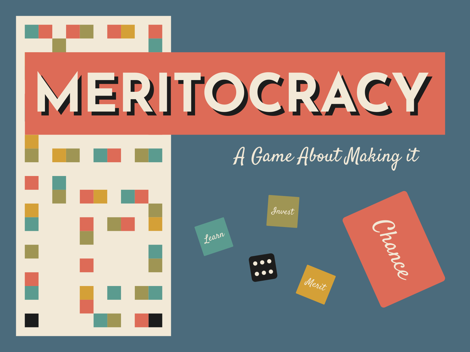
Meritocracy: The Board Game is an original concept for a family board game about capitalism, the accumulation of wealth, and systemic inequality.
I am currently prototyping and testing this project.


Each player starts with different resources, drawing a "start card" that awards money, advantages ("lucky stars,") and a light backstory.

Random events impact players differently according to their resources. Players with more resources get bigger payouts and can avoid setbacks.

Merit Tokens are given unique, real-world titles to help players fill in details about their in-game autobiography.

Learn Tokens may be acquired to gain new advantages, but cost money that players may not have.
Goose Promotions (GP) is a disc golf brand primarily associated with amateur tournament production.
I was initially tasked with creating a logo that would combine a custom goose icon with the brand name.

The client supplied the golden-orange color, #ffa300. I used it to build an analogous color scheme that manages to feel both sporty and vintage, a feeling that I reinforced through a forward-moving, curvy, serifed title font.

Once the brand identity was established, I created an event flyer template in Canva, which the client was already using. Tournament directors (TDs) can now create on-brand event flyers for social media to promote upcoming events and recognize sponsors.

The multi-event template uses similar design language to allow TDs to announce monthly event schedules or upcoming leagues over social media.
The Power Disc Golf Academy Championship Series is an nationwide series of disc golf tournaments held at courses around the United States.
I used the existing Power Disc Golf Academy logo, along with a minimalist take on a few traditionally athletics-oriented design elements, to form the series logo.


The flyers use a color scheme I created to complement the simple red and black combination used by Power Disc Golf Academy.

This disc manufacturer provided a maximum and minimum line weight, required the center sprue to be clear, and did not allow text to be "cut out" of a solid background.